(redirected from Users.RFM)
Note: analytics on customers is updated once an hour. If some changes occured in analytics, you will see already changed data when downloading.
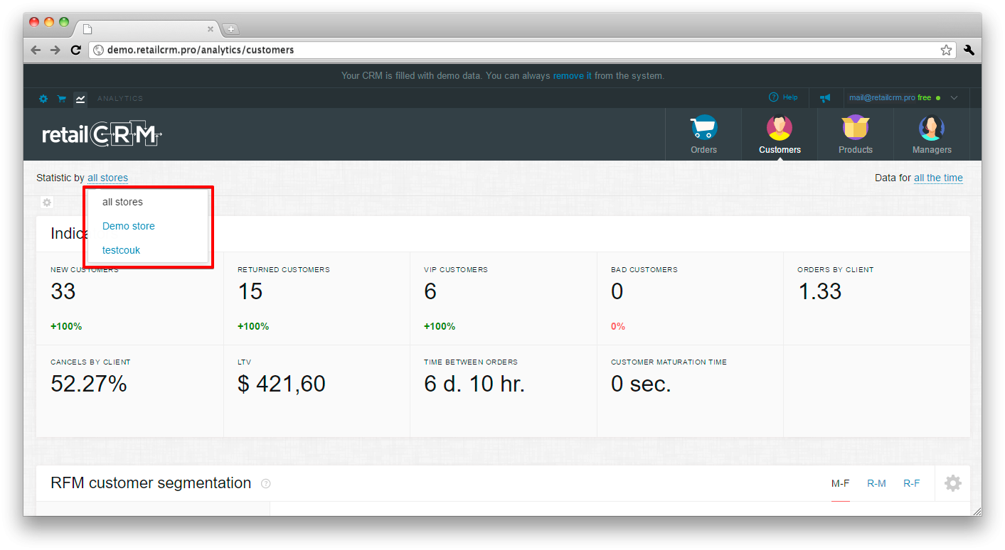
There is a unified filter attached to the upper part of the page which stays visible when scrolling the content.
With its help you can:
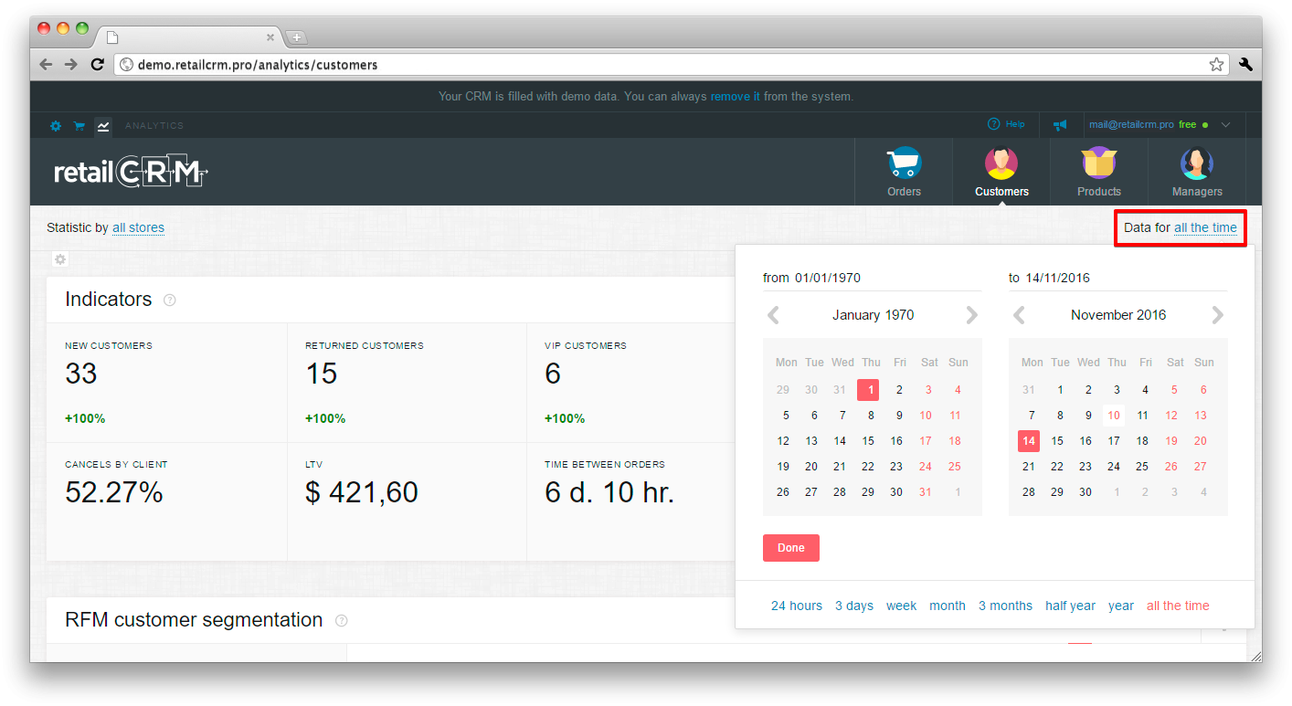
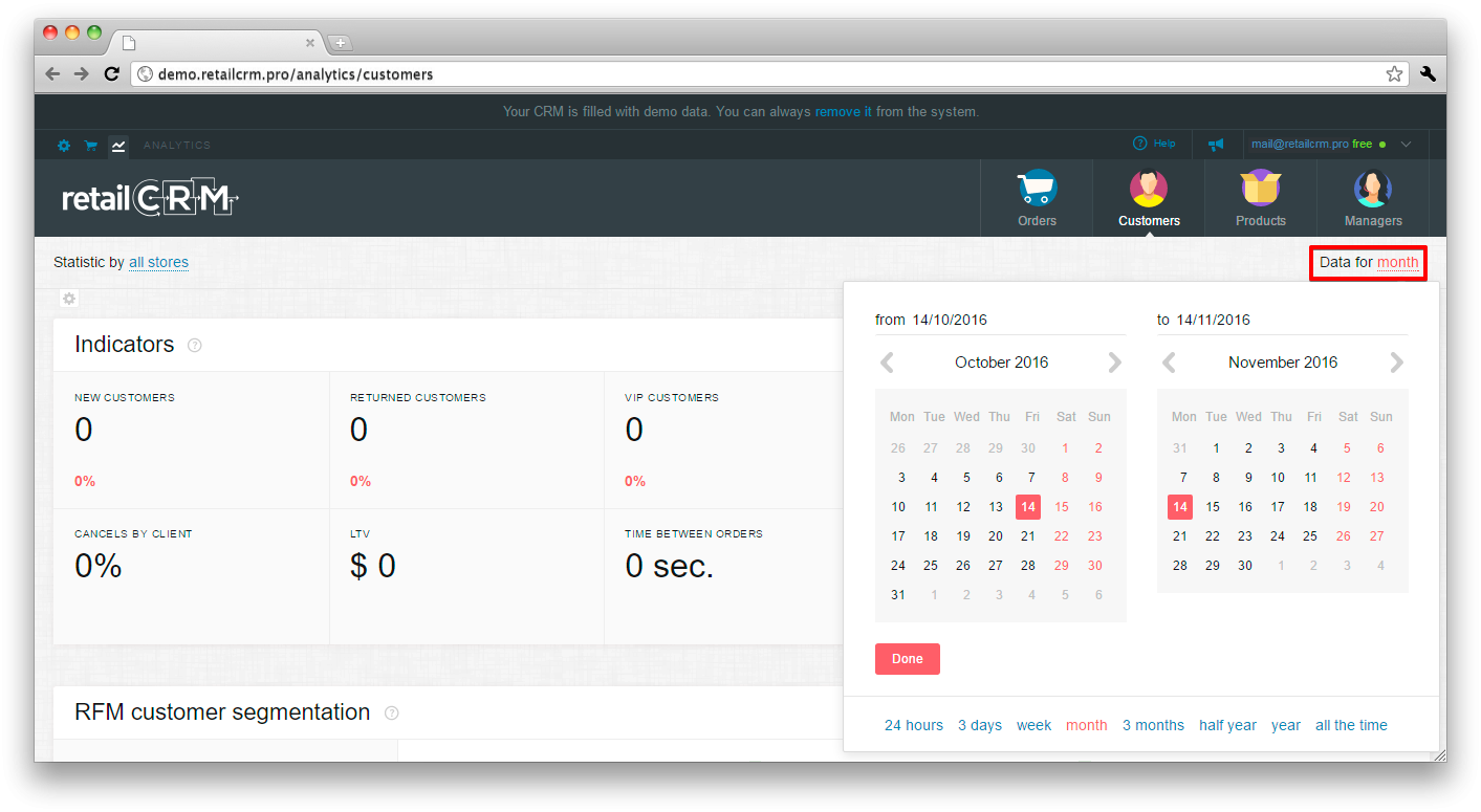
If you need data on a definite date, you need to select the starting and the ending dates in the calendar and press “Done”, the period will be shown the following way:
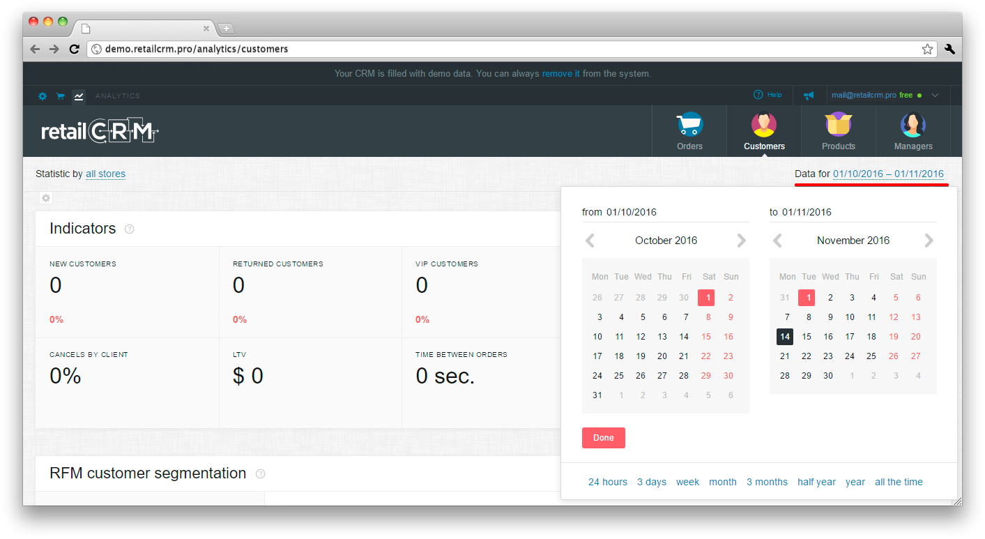
It is also possible to select a relative date. For example, if you need data only for a month.
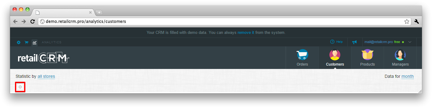
Under the statistics there is a ger button, pressing which you can cofigure the panel.
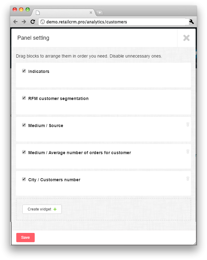
As you can see on the screenshot, the configuration has the headings of all KPI panel data. In front of each there is a checkbox, allowing enable or disable reports on chosen criteria. It is possible to move blocks to put them in the needed order and disable not needed ones. It is possible to create new widgets.
This widget shows key metrics on customers.
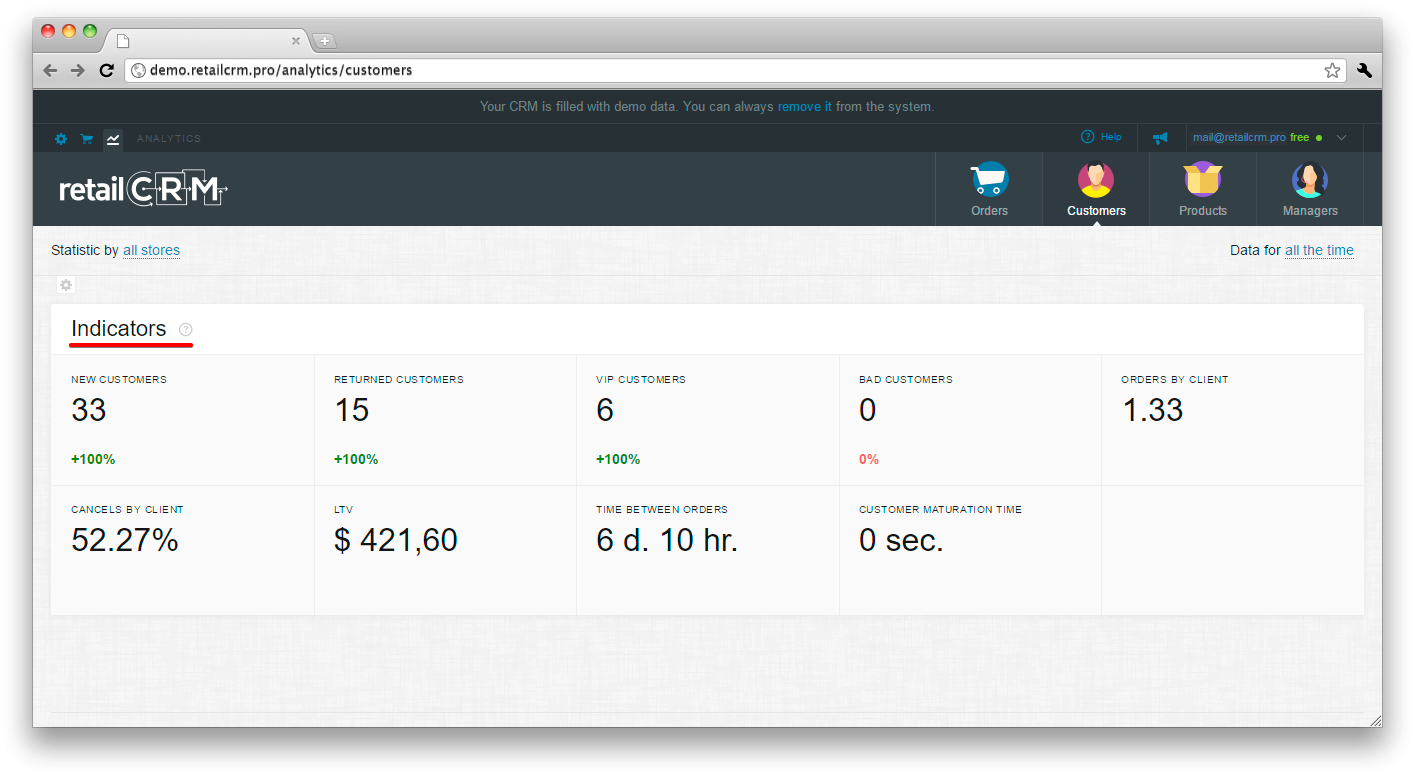
The percentage in a small font below the indicator shows the change of the current value comparing to the previous one.
Let’s have a look at each indicator separately.
New customers
“New customers” indicator shows total number of new customers for the selected period.
Returned customers
“Returned customers” indicator shows total number of returned customers for the selected period.
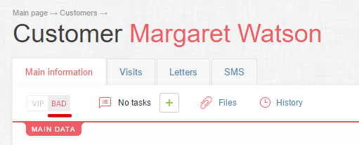
VIP customers
“VIP customers” indicator shows total number of customers marked as “VIP” for the given period.
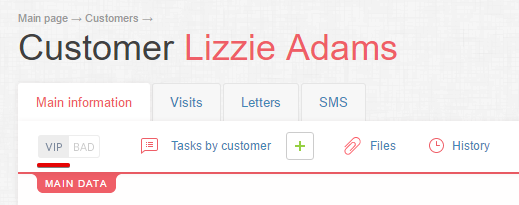
Bad customers
“Bad customers” indicator shows total number of customers marked as “BAD” for the selected period.
Orders by customer
“Orders by customer” indicator shows total number of orders per single customer for the selected period.
Cancels by customer
“Cancels by customer” indicator shows total number of cancels per single customer for the selected period.
LTV
“LTV” indicator shows total profit (margin) of a single customer for all his lifespan in the company. In the widget it is calculated as the arithmetic mean of profit for all customers for the selected period.
Time between orders
"Time between orders" indicator shows average time between rders for the selected period.
Customer "maturation" time
Customer "maturation" time indicator shows average time from customer first visit to his first order.
RFM analysis is a prediction of customer behaviour based on his previous actions.
The analysis is based on three parameters:
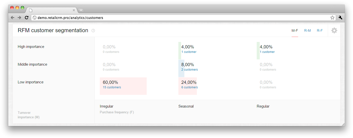
Such segmentation provides a glimpse of the customers who will make an order, and of those who don’t even react on the offer. It is supposed, that the customer who approved himself not so long ago and who is showing overaction or spending more money on goods is the most interested customer in ad campaign.
The widget displays customer base segmentation results on three parameters:
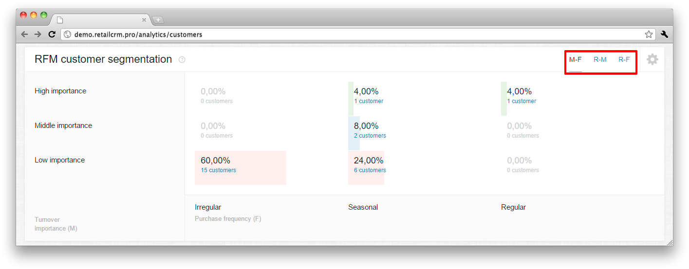
When choosing “R-M” and “R-F” parameters, vertical axis always relates to recency, and horizontal axis characterizes importance in turover or frequency of choice. The indicators can be one of three positions: low, medium, high.
When selecting “M-F” parameter, vertical axis is responsible for importance in turnover and horizontal for purchase frequency.
The crossing of indicator values shows the number of customers who satisfy this values.
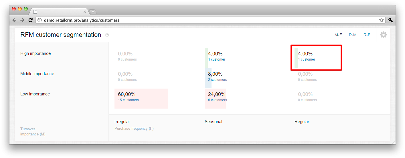
When pressing the segment, the page of customer base is loaded, where the list of customers who get into the segment is shown. If the system user doesn’t have access to “Customers” section, the RMF widget, as a result, will not have links from segments.
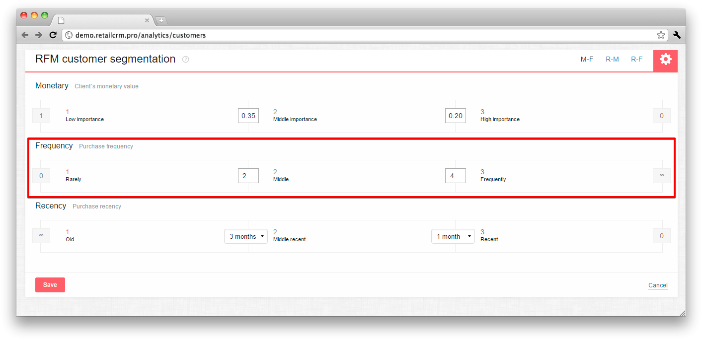
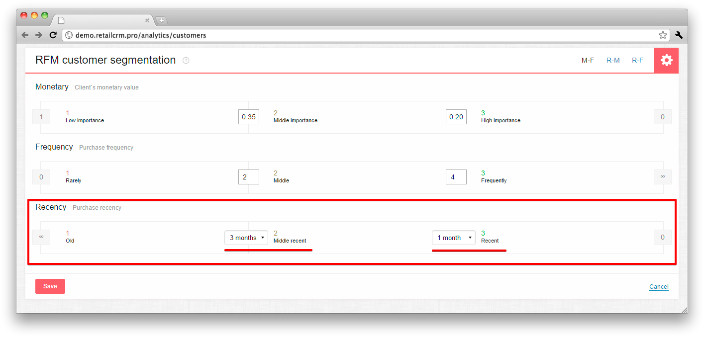
It is possible to set thresholds of getting to RFM segment. To do it you need to press the gear in the right upper corner of the widget and configure the indicators as you wish.
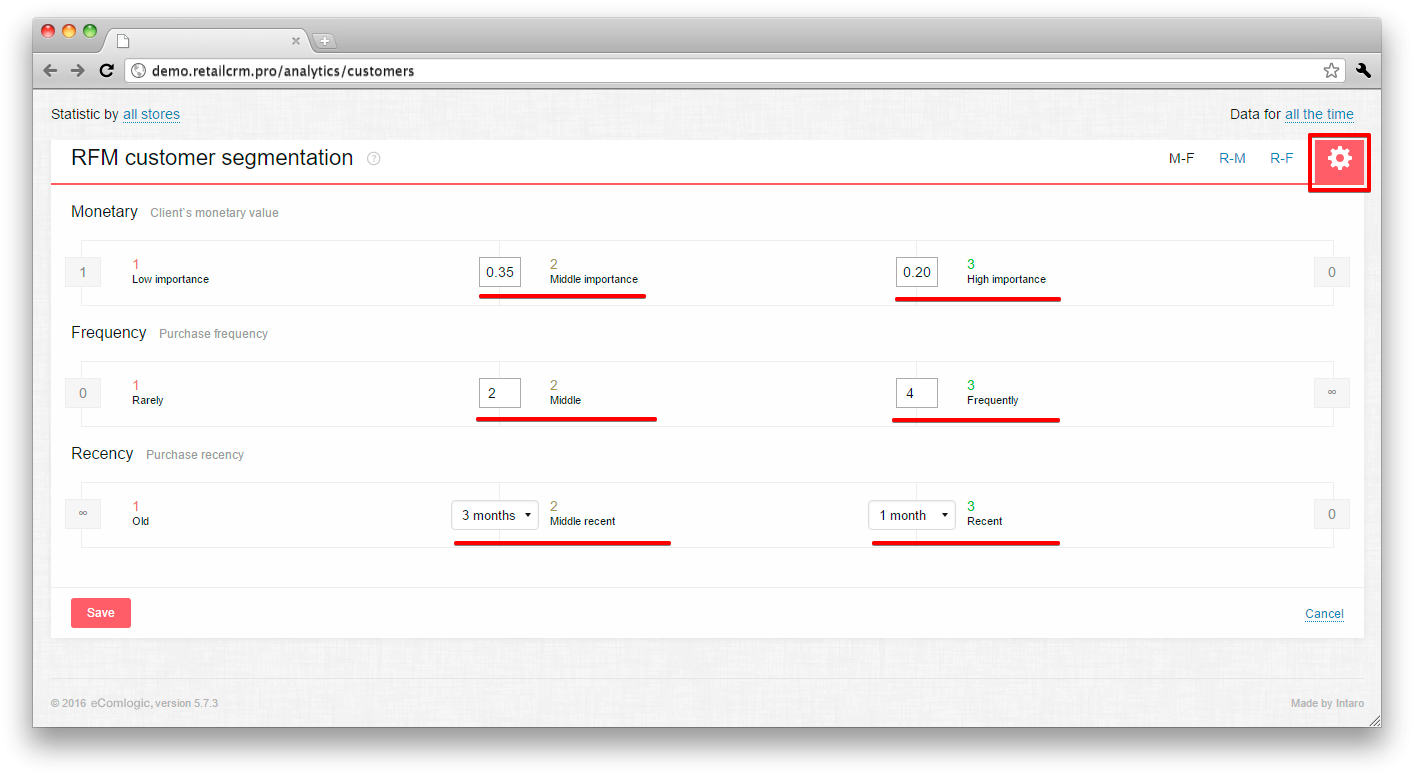
Let’s have a closer look at how to configure indicator correctly.
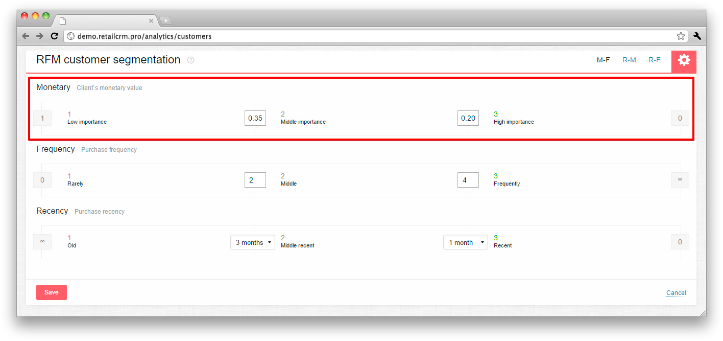
Monetary:
In the system RFM analysis module all the shop turnover is taken for 1. Customers, who made orders in your shop are sorted by the order sum in descending order: the most active customers - on the top, the least active - in the bottom. Then the system sums them up in sequence.
To make the Monetary calculation process clear let’s take the N shop total sales turnover for 100 dollars. And the customer base for all the time will consist of 4 customers who have purchased for 60, 20, 15 and 5 dollars.
Calculating the indicators:
So, shop N needs to set thresholds about 0,7 and 0,98, for the first customer to get into first segment, 2 and 3 - in the second segment, and fourth - in third segment. The real shop has a lot of customers, that’s why these thresholds are closer to the beginning. System has 0,2 and 0,35 by default.
Frequency:
Here you write in the borderline values of order frequency of your customers. To get these numbers go to section Customers in the system and sort by the number of orders.
For example, if customer A has the biggest number of orders - 10, and customer B has the smallest - 1, and there are also customers C, D and E, that have 8, 6 and 3 orders correspondingly.
In this case the number of orders between “Often” and “Moderately” will be 7, and between “Moderately” and “Seldom” - 4. At that rate customers will be analysed in the following way:
Recency:
The indicator of first purchase recency is individual for every business. That’s why set yourself the time limit from the moment of last purchase, that will be suitable for each of the metrics (mid recency/recent).
After saving the settings background indicator recalculation is launched.
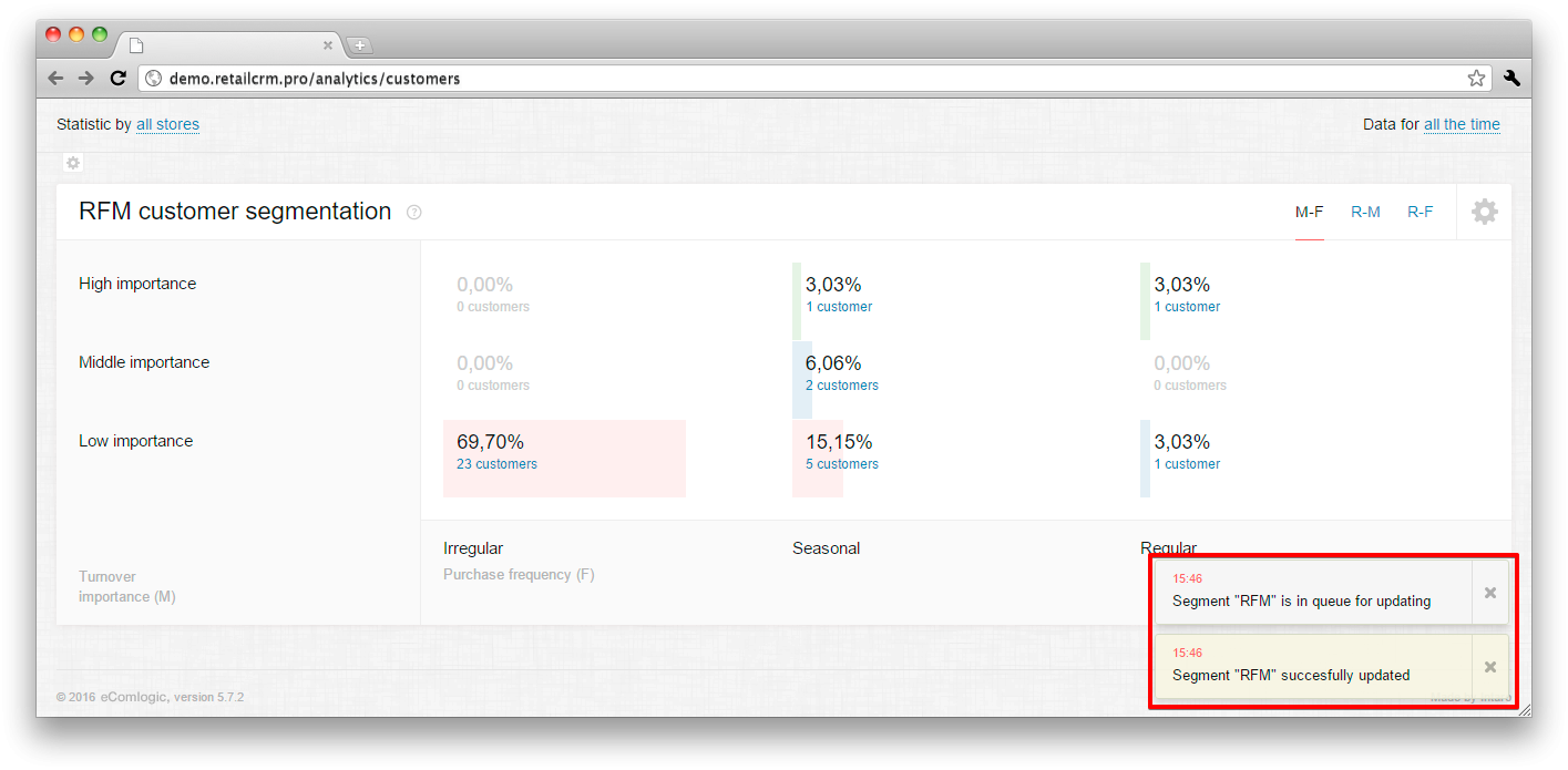
The user is notified when the recalculation is finished. Deleted and cancelled orders/customers are not calculated in segments.
The universal widget allows you to build your own reports on the selected parameters.
Let’s have a look how the universal analytical widget looks like, how the reports on the selected indicators are made and how to configure indicator axes to get more complete information display on the searched parameters.
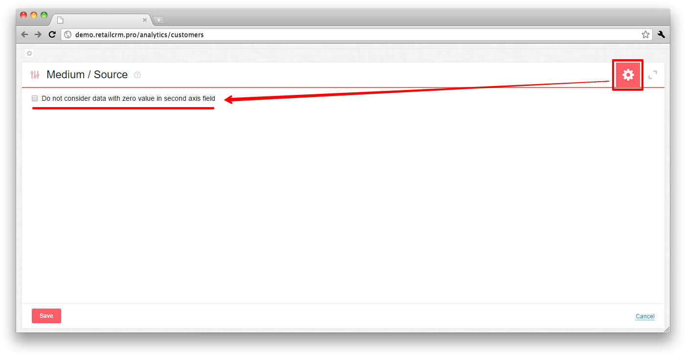
There are two icons in the right upper corner of the widget: “gear” and “diagonal brackets”.
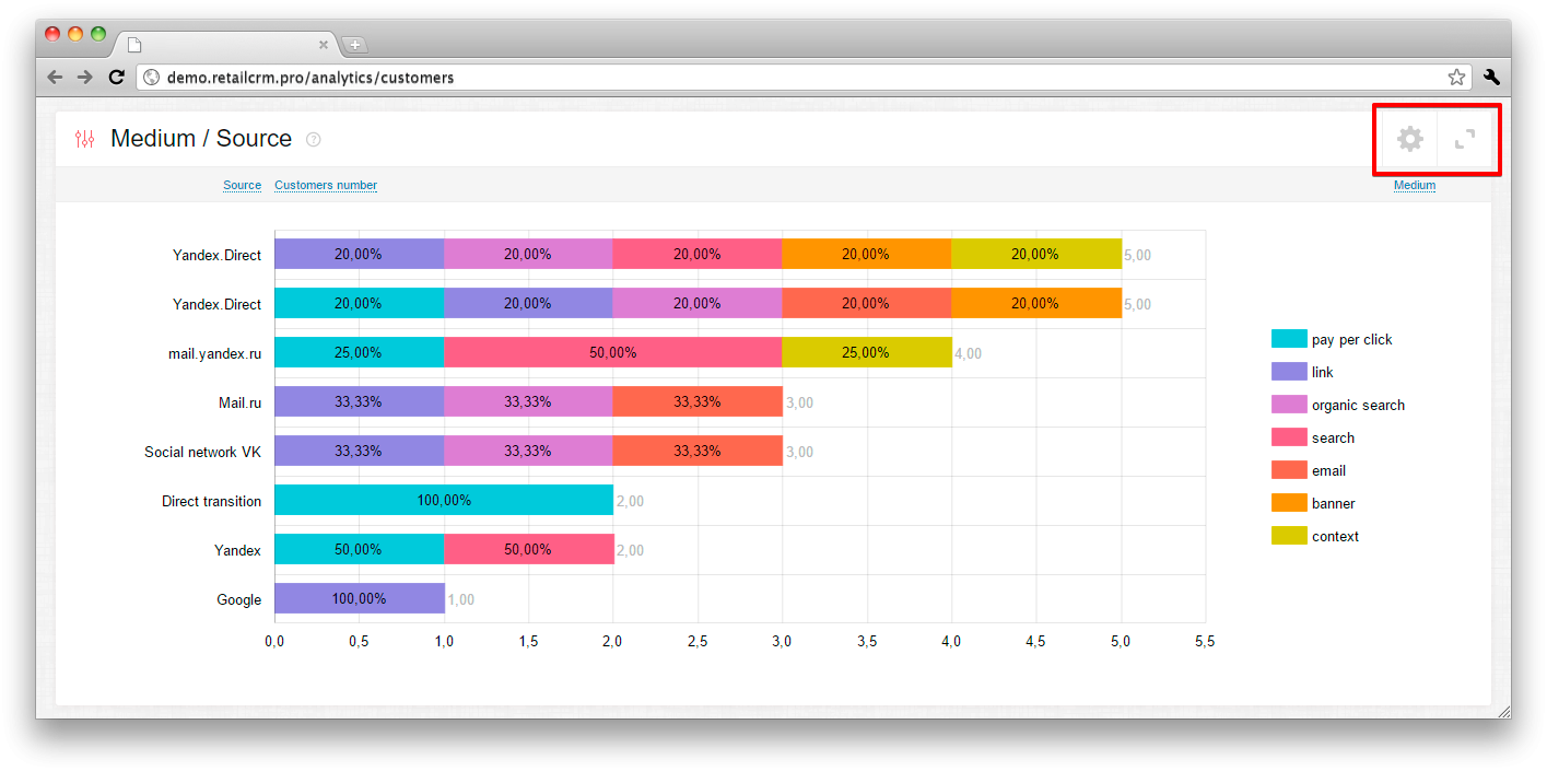
If you press the “diagonal brackets”, you will see the report in maximized mode.
There is an option in maximized mode to download a report in one of four formats: xls, csv, xml, json. The system will upload 500 records maximum.
If you press the “gear”, the settings panel will open where you can restrict to calculate data with zero value in second axis field.
It is possible to set and vary many parameters for analytics in all widget axes.
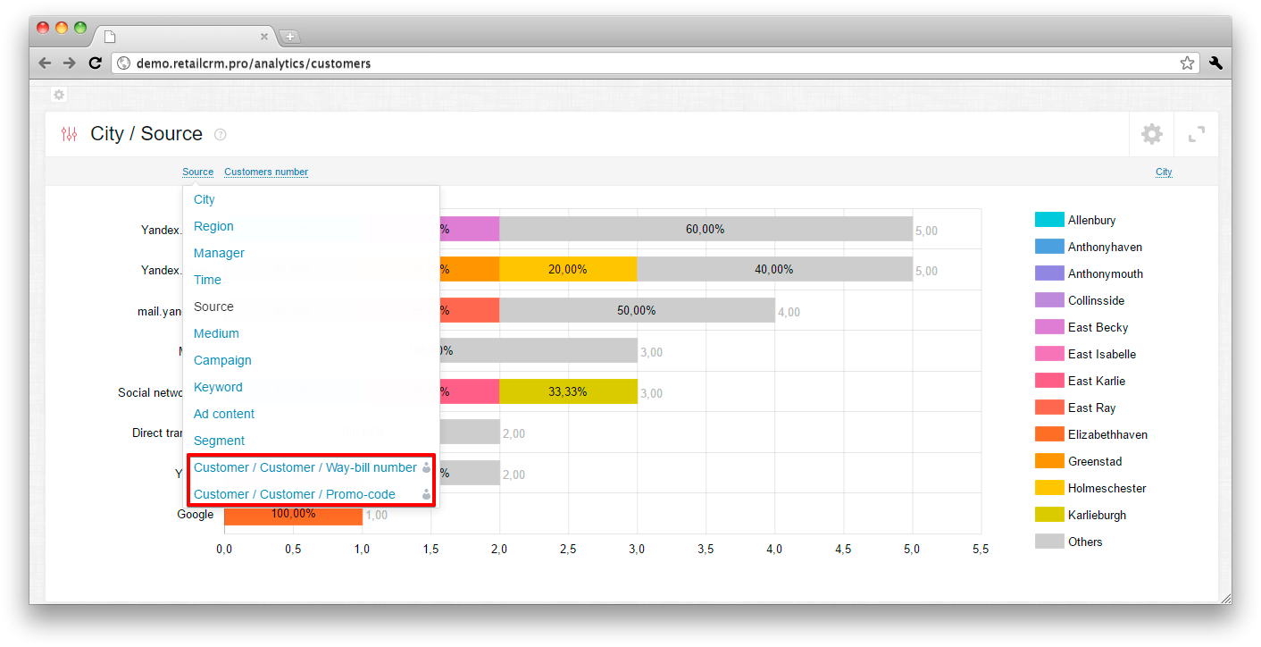
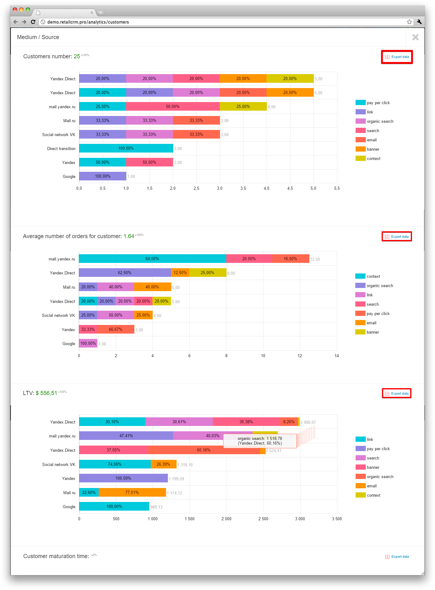
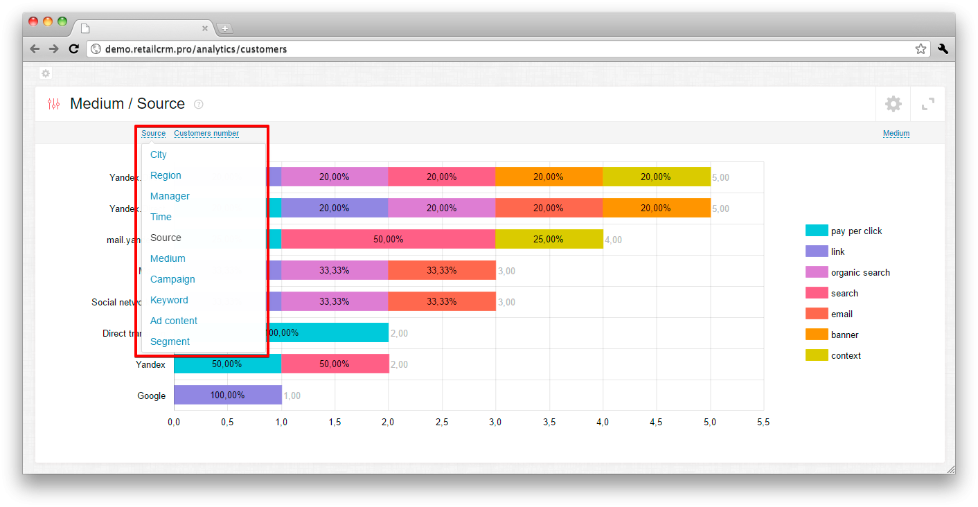
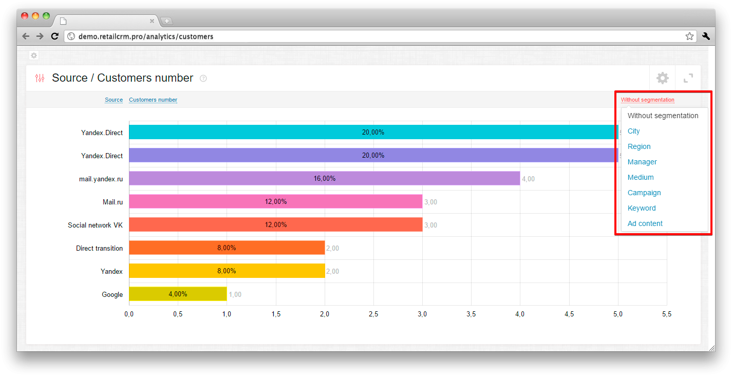
The first axis is the indicator, which has the data you are interested in, for example the Source, where the customer came from. Pressing the name it is possible to change this indicator selecting the one you need from the dropdown list.
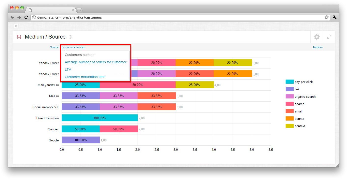
The second axis are indicators, characterising profitability of resources:
If in the first and the third axes it is possible to apply many parameters for making a report and it is allowed toadd new parameters, then in the second axis the number of parameters is strictly limited.
In maximized mode it is possible to see several graphs on all variants of second axis at a time.
The creation of the third (non-obligatory) axis is implemented in the system - segmentation of the columns themself. The inclusion of an additional parameter for analytics divides the column to separate parts that allows to get more full and detailed information on the selected criteria. As well as in the obligatory axes, it is possible to select the necessary parameters for analytics by pressing the name.
If the third axis is for example set on Sources, then in the third axis it is possible to set any other parameter from the given list except Sources.
By selected obligatory fields Source / Customers number, for example, segmentation with the help of “City” indicator in the same graph. The column has been divided to parts - segments. It became possible to see the number of customers in percent and due to the specified segmentation we see from what cities your customers came from.
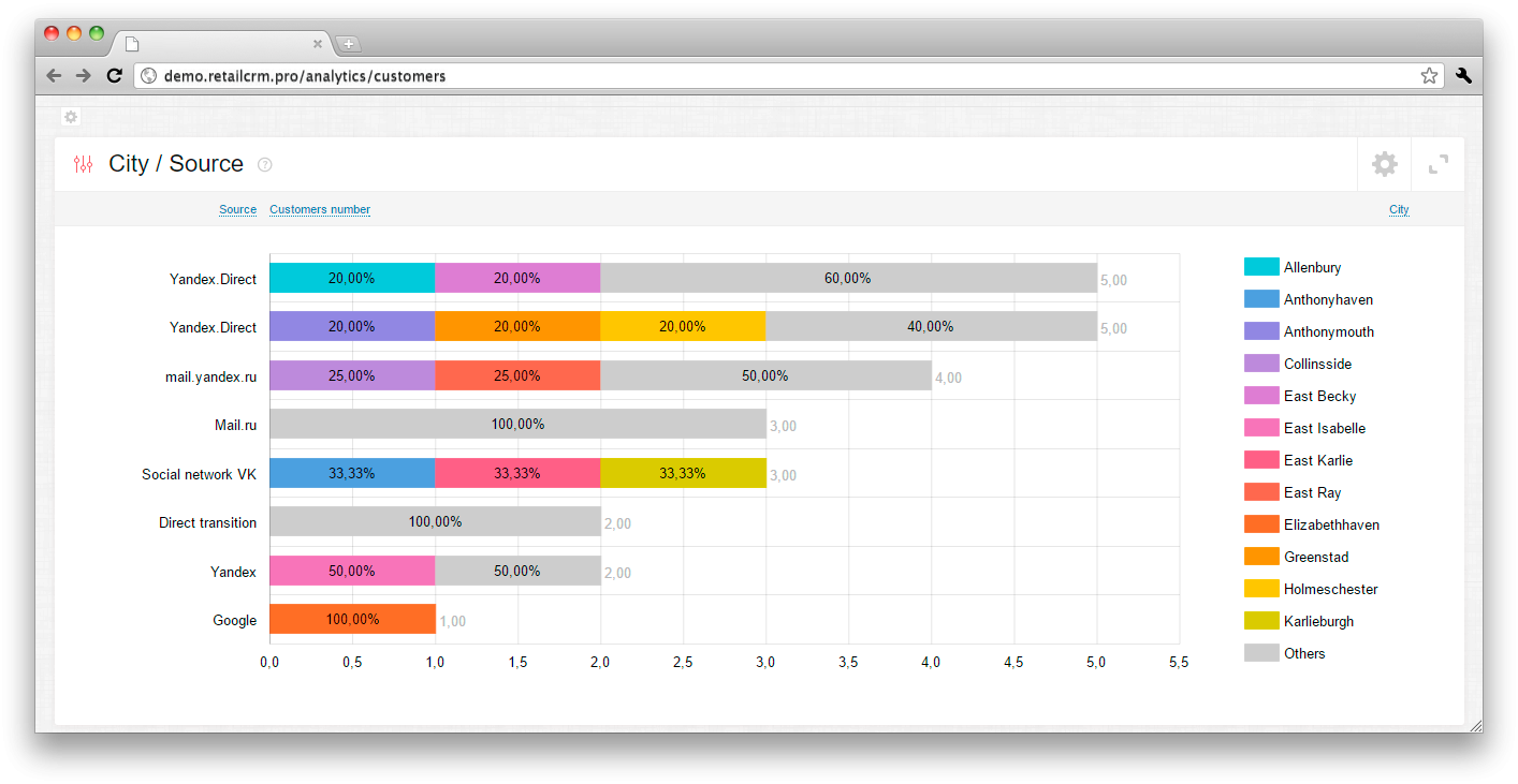
If the 3-rd axis is specified, the widget heading is formed as [3-rd axis] / [1-st axis].
It is possible to add additional data in the system, on which you can collect analytics. They are created as custom fields in section Administration > Settings > Custom fields.
You can read more about the additional data creation in the article «Custom fields».
Additional data in the dropdown list of the first and the third axes are marked with a “man” figure and are placed under the main indicators list.